


Responsive Web Design
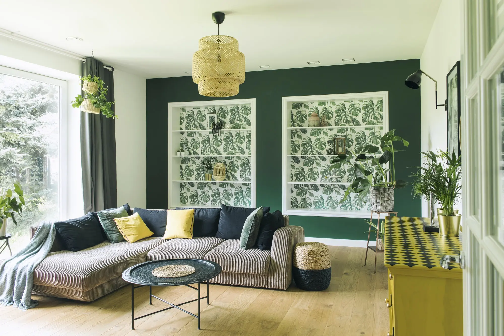
Beautiful on Any Device

It’s not only about mobile search ranking. Responsive website design is essential in presenting a consistent brand image across all devices.
Website, in the end, means nothing if the said presence doesn’t provide positive experiences for the prospective audience.
Mobile-friendliness can be an important design consideration that often gets overlooked or glossed-over during website creation or redesign. It’s a requirement of some, for others yet another feature in the look package. Either way, responsive web page design has a huge effect on the overall performance of not only your site but also your marketing strategies.
Smaller Screens, Similar User Experience
-
In the past, mobile friendly-design wasn’t important. Most websites were unwieldy and extremely difficult to navigate for mobile users. But the amount of mobile-only browsing activity rose, and with it the preference for mobile-friendly websites.
-
Responsive web site design became vital in not merely SEO but also in creating a consistent brand image and obtaining a cut in the ever-growing mobile user market. Mobile users now expect consistent viewing experiences in every devices.
-
Websites should adjust to mobile demands in format and navigation but nonetheless look familiar for an individual. Menus and submenus should be in the same locations within the website.
Expertise and Experience in a single Company
-
For over twenty years, Prozco Branding a trusted name in web site design, keeping before trends and technology advancements in the market. And as responsive web design became vital in the success of websites, Prozco Branding stepped up to create quality designs that aren't only adaptive but also highly optimized.
-
We aim continually learn the best practices, match emerging design concepts, and additional hone our team’s expertise in the field. Consequently, we consistently produce innovative responsive web and mobile-only website designs offering seamless user experience across different device sizes.
Create a Seamless User Encounter with Prozco Branding
-
Responsive web design is an essential expense you can’t skimp on. It’s an individual build that it could last your website’s lifetime if applied properly. Prozco Branding’s responsive web site design services aren’t nearly changing the way the website appears across devices, but also making the web site mobile-friendly in all aspects in order that it will load and run perfectly on mobile.
-
Probably the most important changes is on the website’s CMS. Responsive design projects aren’t the same for each and every website and the extent of the necessary changes affects the cost.
-
The price may rise or down based on the website’s structure, the extent of the required design adjustments, and the website’s graphical elements.
Prozco Branding
This design flexibility and seamless user encounter are just achievable through responsive web design.
Mobile Responsive Design
Your customers aren’t usually sitting on a desktop. They’re on the phones - and your brand needs to be too. The perfect solution is: mobile responsive design. That means that your site dynamically resizes to focus on a phone, tablet, or desktop, without sacrificing content, design, or functionality.
It’s the easiest method to ensure that your customers can interact fully together with your digital presence, irrespective of where they are.
Did we mention it boosts your rating in search? ICYMI, internet search engine algorithms are beginning to prioritize sites which have a “mobile-first” approach. Bonus: it’s also easier for se's to crawl each page when it’s optimized for all screen sizes. Which means a mobile responsive design helps your website pop up 1st in the SERPs. TL;DR: if you’re a brand in 2018, it’s time for your site to be fully mobile responsive.
-
Whether you’re building out a fresh site from scratch or just updating and optimizing your current one, we’re your go-to resource to ensure it’s ready for the evolving digital ecosystem.
-
We take time to understand your brand - as well as your brand’s needs. We dig in to the architecture of your present site to understand the intricacies.
-
Then, we create a responsive structure and design that translates your brand and user experience onto every little bit of technology out there.
-
As we optimize your website, we make sure it displays elegantly on all devices. An effective mobile responsive design means even more sustainable wins for you personally.
-
It also means higher conversions, higher user satisfaction, and better organic search performance. With a dynamic page setup, you’ll be prior to the curve with regards to your brand’s digital experience.
-
Creating a mobile responsive design means coding every type of the site. We restructure the code to become thoughtful, strategic, and effective.
-
Our design resizes all areas of the website, from headers and menu choices to dynamic media.
-
Through rigorous user testing and QA work, we make certain the user experience can be seamless and the very best it can possibly be.
-
We of ninja-coders has a great deal of experience with multiple sites and platforms.
-
You can relax, relax, and watch your site transform before your eyes. Our focus on detail and technical acumen ensures your website looks beautiful - and performs perfectly - on every screen: mobile or desktop, iPhone or Android.